This was a tutorial that's been pending for a really really long time. Everyone asks how it's done and how I apply it to my projects to give the old vintage look. It's very easy but takes a little practice :)
While there are Tim Holtz Distress inks available, I use the ones I have lying about at home. While Tim Holtz distress inks give you all the right tones and vintage shades, I feel I can make do with dye inks I have sitting at home.
The inks I use most for distressing our Martha Stewart's Cat Eye stacking ones. Simply because the clasps on them come loose and the sponge tears up rather easily. If you find them on sale, go for it... and keep them for your distressing projects. :) They're not as wet as other pigment inks, so they're great as they don't leave blobs and blaps of color on your paper, they give the dry brush feel which looks more genuine when distressing for the old vintage look.
If you haven't got yourself some pigment inks. You can always dry out the Dollar Ink Pad, keep a sponge and dab it over the ink pad. It works just as well :) If you want more colors, you can opt for poster paint, dab it with a sponge, use it when almost dry for optimum results. :)
Let's get to it shall we?
PS: If you have a dark sheet of paper or cardstock, instead of the pigment ink, go for the chalk ink. Chalk ink shows on dark surfaces, pigment ink doesn't. They're both going to be slightly wet so be careful not keep dabs of ink on your paper.. use the edge of the ink pad against the edge of your paper. Do not, I repeat do not, dab the entire ink pad on to your sheet of paper :)
Method ONE

The ink I'm using is this one by Studio G.

Just showing you what happened to the Martha Stewart one... the sponge is nearly coming off. This was once a bronze.


Can you see the torn sponge?

So we'll begin now :)

I just smoothed over the edges with the ink pad... because the ink pad is fairly new, the pigment ink is still super fresh and very wet, hence the dense appearance on our ornate tag.

I want to tone that down...

Because my ink pad/sponge is nearly dry, I'm going to make use of it by sponging over the edges...

This allows the ink to blend in a little :) Looks better already!
Method TWO

Now that you can see the sponge ink is dry, I'm going to dab the dry ink pad over the black one...

Just tap it gently.

See, it grasped the color.. you can see the black ink.

I'm going to go around the edges with the ink pad.. the dry one we just inked. *with the sponge so to speak* Gives it a nice touch, blended, hazy.. works perfectly!
SAME RESULTS

See the results?
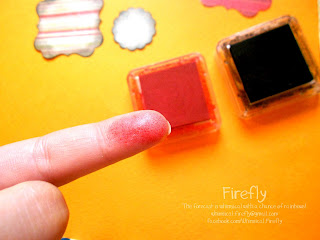
Using a different color

The red one, is like the black one, pigment ink..

slightly dry.

Just to show you the intensity.

Going to go ahead and distress it here... for the blended look. If it were as wet as the black one, I'd go over it with a sponge. :) Just to even out the color.
Hope this was helpful :)
No comments:
Post a Comment